
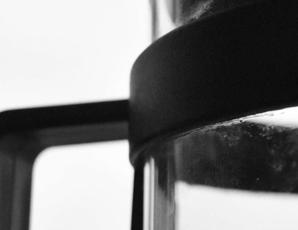

My photos were taken in colour; however, they were edited to be monochromatic through the use of Lightroom. I attempted to replicate Aaron Siskind’s use of contrasting light and dark, as well as, his use of accentuating lines, curves, and shapes. Although the eventual outcome of my photos barely resembled the works of Aaron Siskind, I found that accentuating the contrast as well as the shapes formed by the objects photographed could make something so simple seem so ornate.
Critique

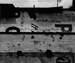

The photos Aaron Siskind prdouces are quite abstract, but also very simple at the same time. His monochromatic photography seemed to focus quite greatly on the texture as well as the lines, curves, and contrast between light and dark. In almost all of his work, these features are always noted. What I enjoyed about the photos shown above is the strong contrast between light and dark. The enjoyed how the distinct difference between the shadows and highlights of the object made the image pop, even without the use of colours. I also enjoyed the very distinct lines, curves, and shapes as well. It was also fascinating to see how he made the simplest of objects (eg. the rocks and wood) seem so extravagant.
Photos from: http://www.ethertongallery.com/html/artist_detail.php?recordID=7